The heartbreaking story of Tyre Nichols had me clenched up all week. I wrote a more fulsome post about his life and what inspired the design elsewhere. Perhaps one day I’ll do some writing about the value skateboarding has had in my life. Tyre was an excellent skater.

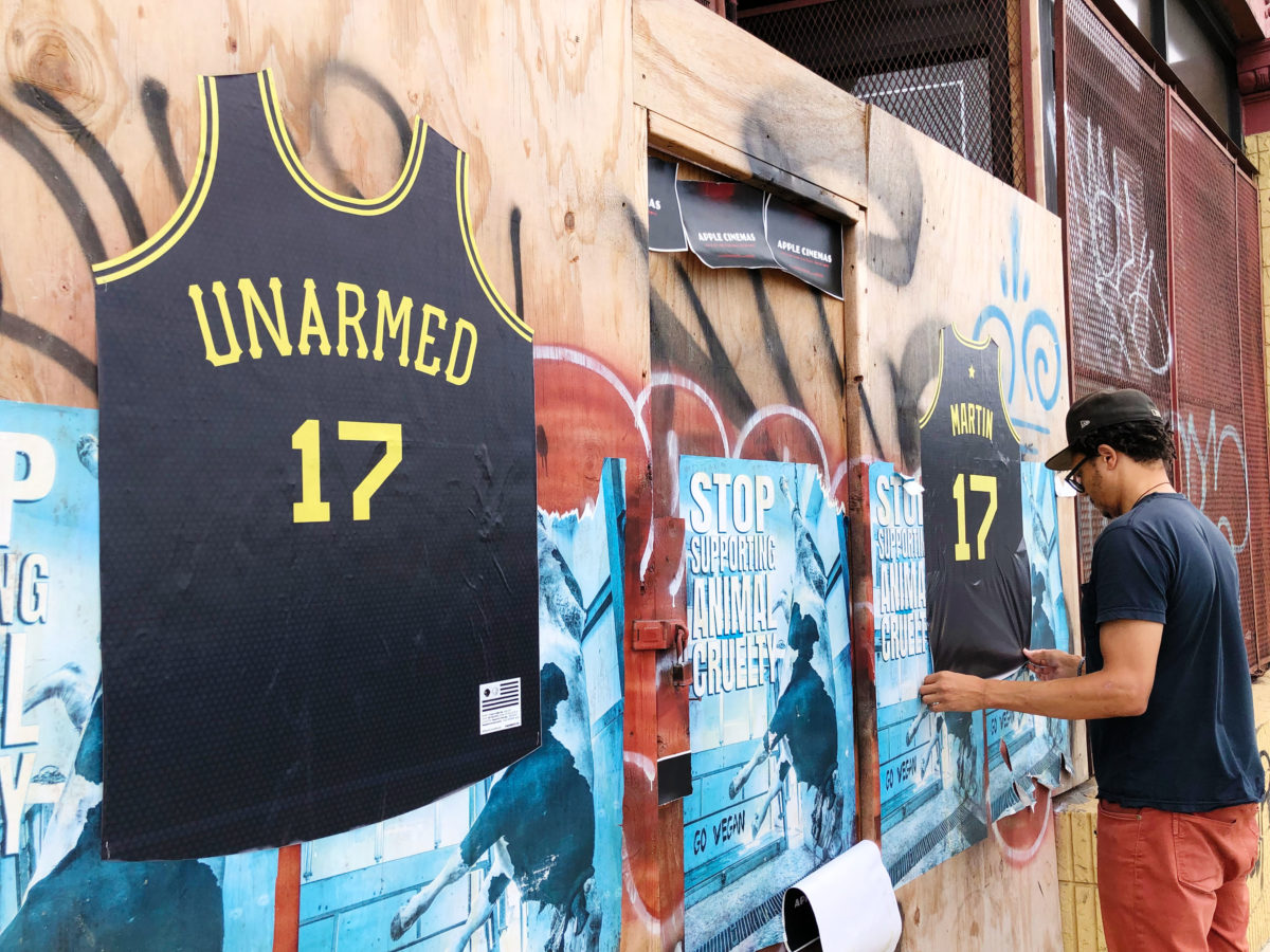
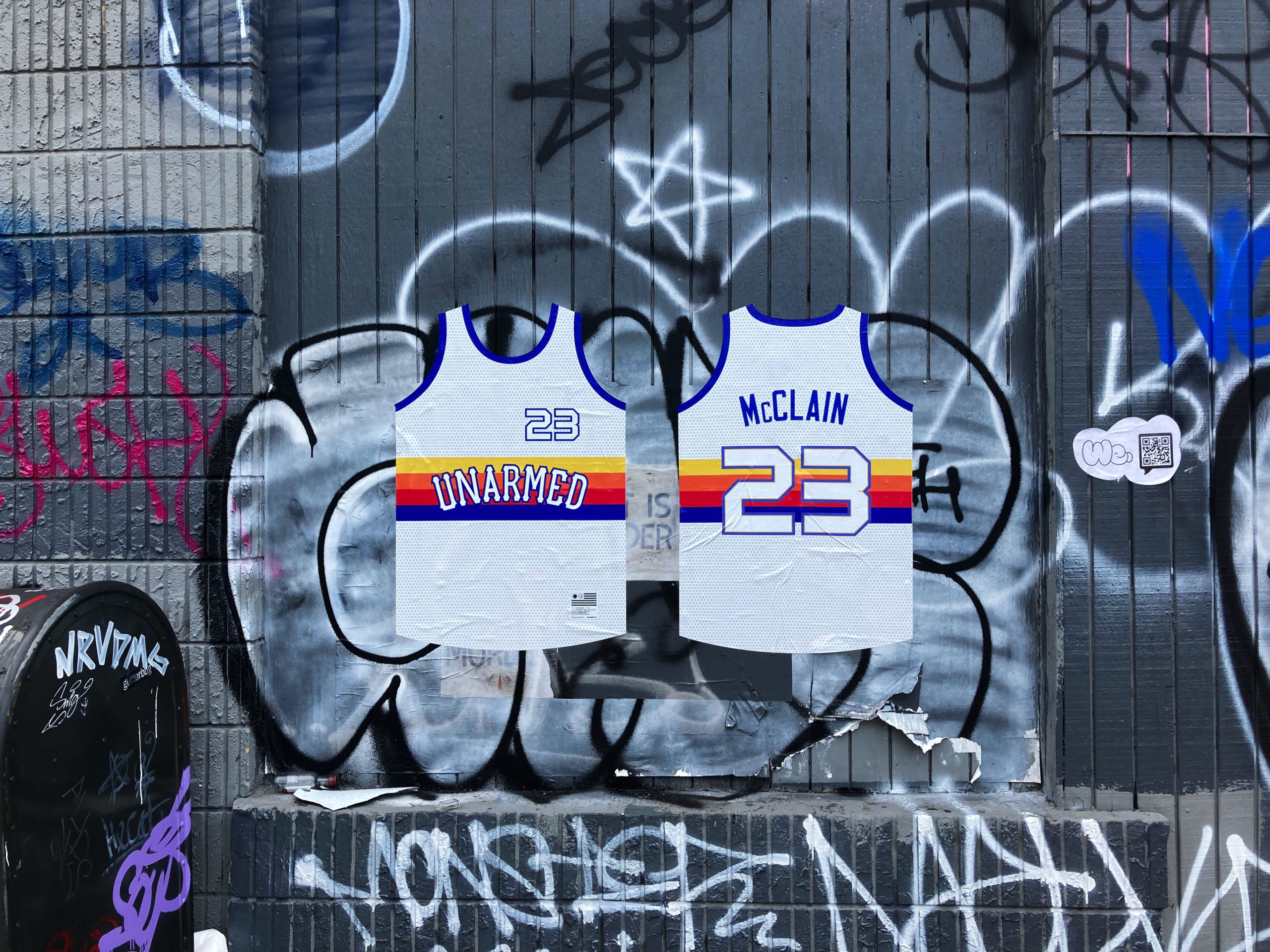
The We. logo above is something that’s been gestating for a couple years. I’ve written before about the fundamentally reactive nature of Unarmed. If you’re designing a jersey it means something bad happened. Developing and spreading a visual language that represents the core ingredient in this project – love – is perhaps the way to be proactive.
If you look closely, the shape of the “W” might even look like a person with their hands up. But if it doesn’t, well, wouldn’t that be better anyway?
Technically speaking the We. logo debuted in Boston back in September 2021 when I did a wild posting there with my friend Lalithra. The QR-code (seen in the second pic) takes you to we.unarmed.co. I hardly posted any images at the time. It’s always gratifying to discover that people post the designs on their feeds, have conversations about them.