

![]()
A few years ago I got into the habit of checking the NBA box scores on my phone right before bed. Mainly on ESPN and nba.com but sometimes right in Google. Then on other sites, lots of sites. And while most places do an OK-enough job acting as portals to other basketball-related stuff, the part I came for – the box scores – tended to be hard to navigate and read.
It’s 30 lines of data, I thought, how tough could it be?
Then I spent about a year working on nbaboxscores.com. Well, before that I snapped awake from a stone sleep at 2 a.m. one night and thought, if the URL is available, I’ll do it myself! Yes, I was quite literally losing sleep over the state of box scores on the internet.
So this is the part where our trusty narrator, Werner Herzog, comes in with his signature baritone and says, “human beings are essentially unknowable. And stupid.”

Although I love designing things, as a coder I’m basically like one of those people who gets booted from The Great British Bake Off in the second week: all heart, and maybe even a couple good ideas. But my moon cake is slumping to one side. And that’s just not gonna fly in a real kitchen.
A functional version of the site was running for most of last season. And a good deal of the look got dialed in during those first few months. Since then I’ve honed a million details on both the front- and back-end that, in the aggregate, I hope make all the difference. The images below plot some of the journey from flat data coming out of an API to a dimensional thing that you can hold in your hand. Each one of these steps cost me blood.
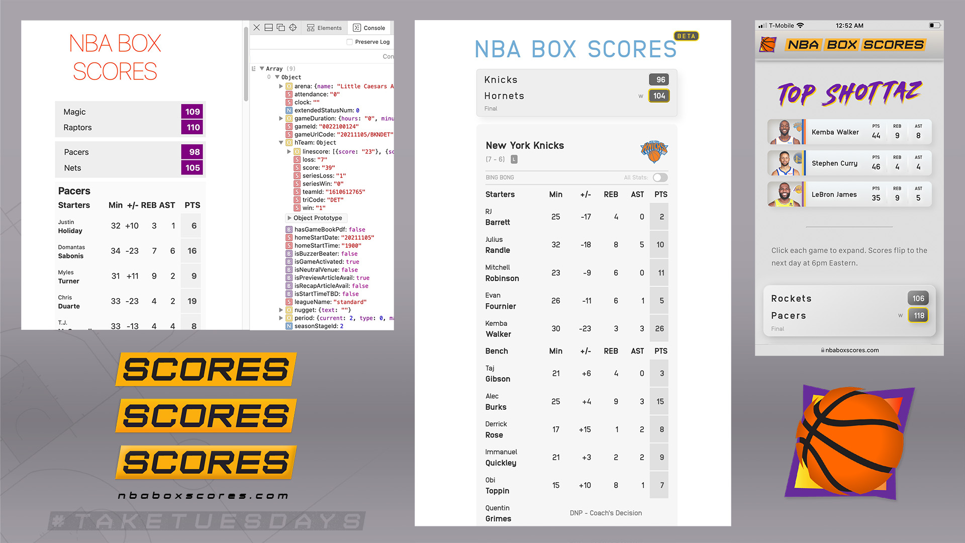
A shortcoming of the current design is that I haven’t figured out a satisfying way to display the data on wide screens – it’s optimized for phones and narrow columns. Just like the first box scores, in agate type on newsprint, darkening the thumbs of eager sports fans everywhere. Perhaps one day I’ll make a “newspaper mode” that pushes this idea further.
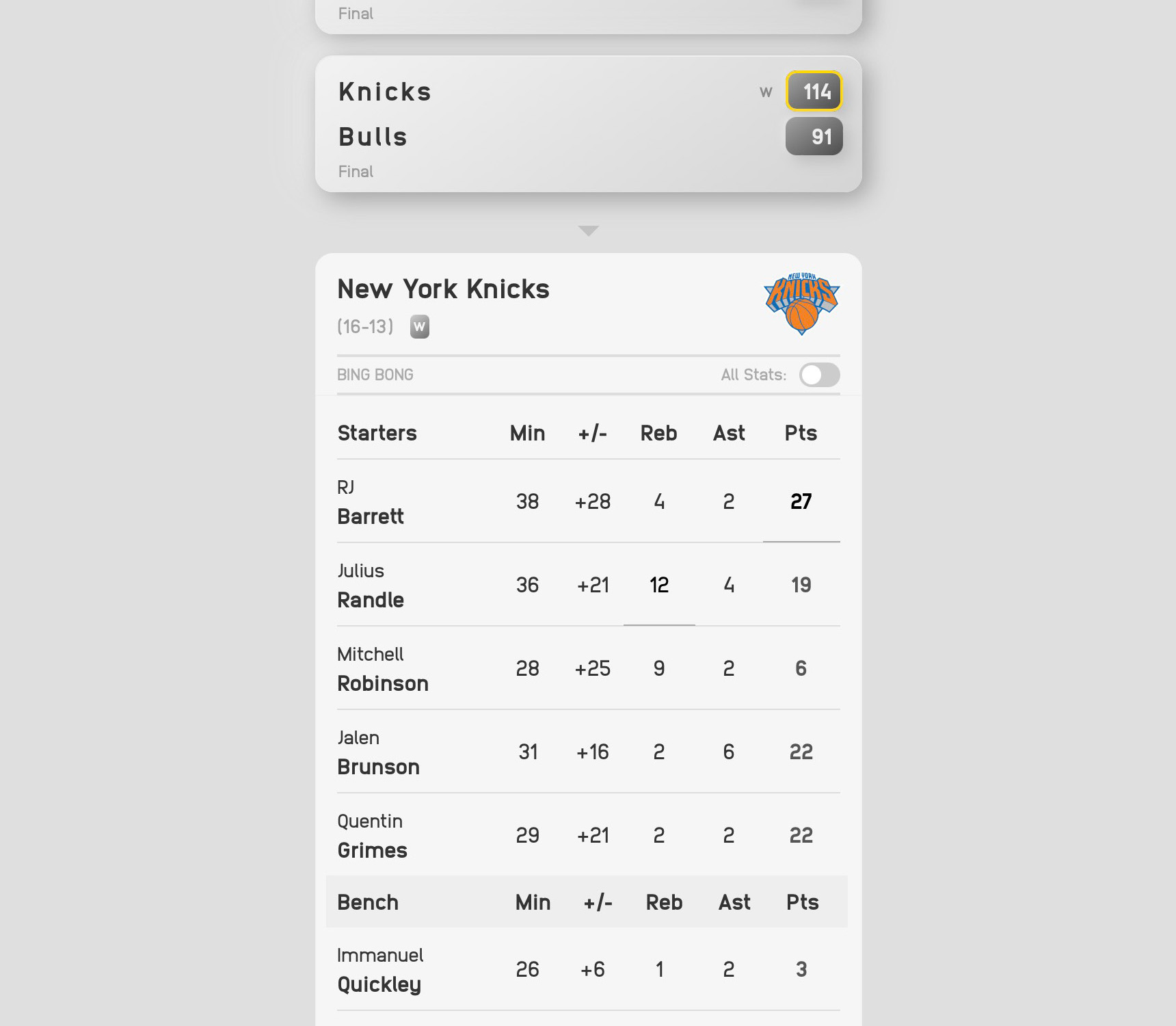
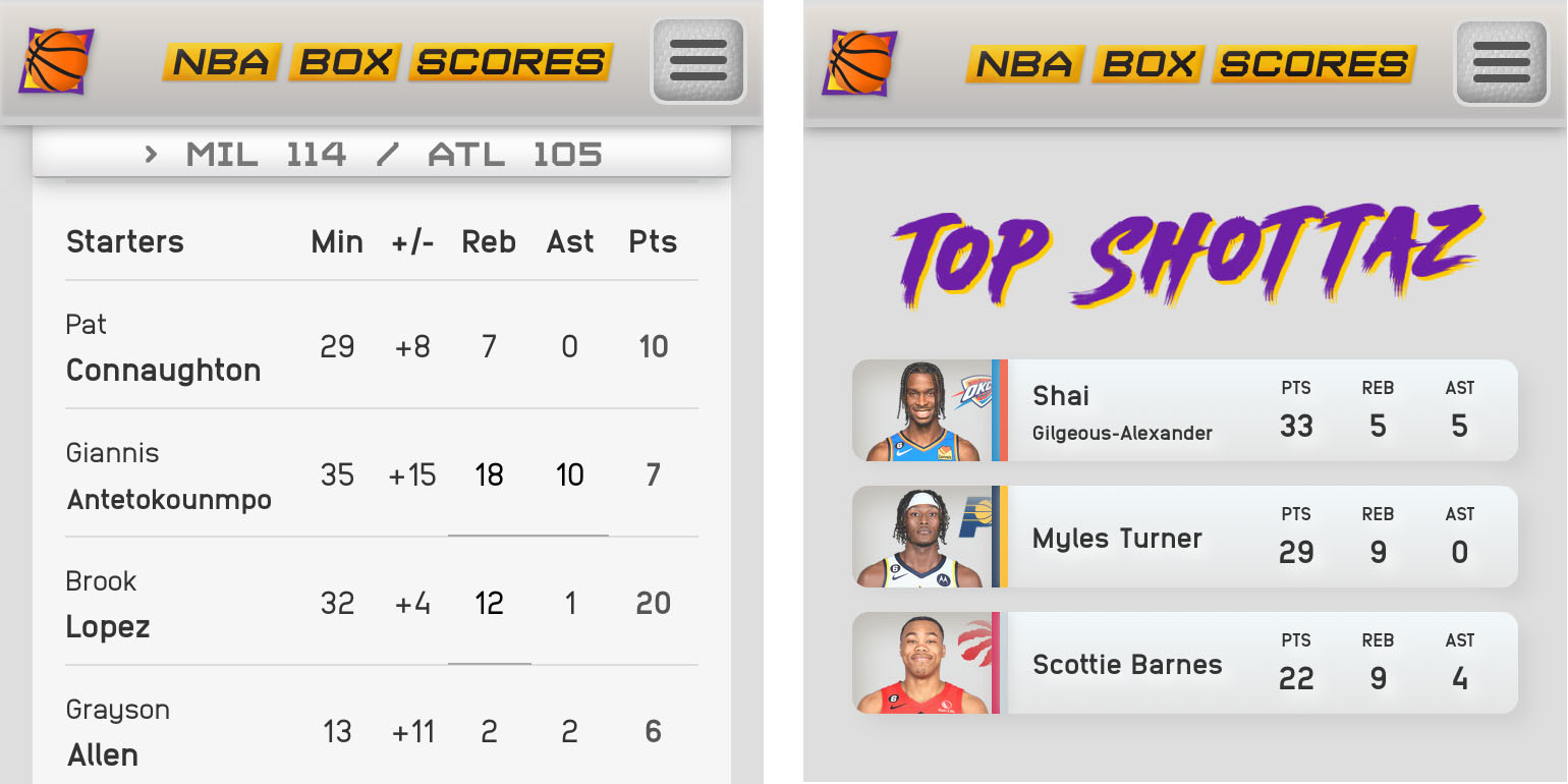
For today, there’s a website that’s pretty good. You can read the player’s whole name, for instance, which solves the dreaded “J. Green” and “D. Wade” problems of 2021. The first view focuses on points, rebounds, and assists. And if engaged, the all-stats mode persists throughout the visit for people who prefer to see the whole line. There are team nicknames, funny animations. But not too many, I swear.

Months before starting this project, I struck up a conversation with guy and his girlfriend at a Red Sox game. He had a scorepad and notebook and told me he’d been to almost all 30 MLB ballparks, that he keeps score whenever he’s at a game. He showed me a bit of his notebook. There were sketches of the parks in there, hand-drawn team logos. Not just scores, not just numbers.

Sports are fun. They should be fun to watch, fun to play, and fun to browse on the web.
So about that. The most original feature comes when you tap on a player’s name. The site enters an app-like mode that resembles a player card and allows the visitor to swipe through the roster. The interaction isn’t new – dating apps have popularized the act of swiping through people on your phone. And kids have been swiping through stacks of player cards for generations. But I’m not aware of another sports site that displays data in this way. And there’s nothing quite like performing a Joe Pesci “I got no more use for this guy” flick to get back to the full roster.
Maybe you go back to look at another player. And then.
The big takeaway, I guess, is that working with data is hard. There are 400 human beings who behave in measurable yet unpredictable ways. If one of them happens to be named Antetokounmpo then he’ll break down your layout just like a weak contest on a Tuesday night in Detroit. BANG! The thing is, there are two guys named Antetokounmpo, one named Gilgeuous-Alexander, and there’s even a guy whose first name is Karl-Anthony. The data changes throughout the night. Some games end before others start. And the last games end after midnight.
If I were designing the About page of a website, for instance, I could just throw a couple ems of margin on that Antetokounmpo and call it a day – make it into a whole scene. Celebrate each of the 13 letters with its own birthday party. The fact that the box score gives you no quarter means you have to design within a tighter expressive range. To use a sports metaphor, you’d better be good at playing defense.

There are times when the site counts how many letters are in a name and scales the text down to fit. And there are other times when a line break is just fine. This isn’t a newspaper – digital interfaces give us infinite vertical space. And yet, the layout should strive to remain terse. NBA Box Scores is nothing if not an opinionated view of what should and should not be in a digital box score, over 100 years after we invented the damn things.
None of these choices were obvious when I started working on this project 15 months ago. You just have to feel your way through them, one broken layout at a time.
Most people make the mistake of thinking design is what it looks like,” says Steve Jobs, Apple’s C.E.O. “People think it’s this veneer — that the designers are handed this box and told, ‘Make it look good!’
“That’s not what we think design is. It’s not just what it looks like and feels like. Design is how it works.”
There are visual moments within the site that I’m proud of, but, mainly, the look is about not getting in the way of the data. The design of NBA Box Scores is all about fetching data at the right time. Which data to save for a little bit and which data to save forever. Which data implies that a guy never got off the bench and which data proves that his jumper is wet. Then, finally, making it look cool, which is the one thing out of all these I actually know how to do.
Working on this project has reminded me how fun it is to learn. In this case I learned a good bit of SvelteKit and modern practices in web design. And I learned to watch the games a little closer, even as the data they produced logged to the terminal.
Who knows? Maybe I’ll do the other sports next.